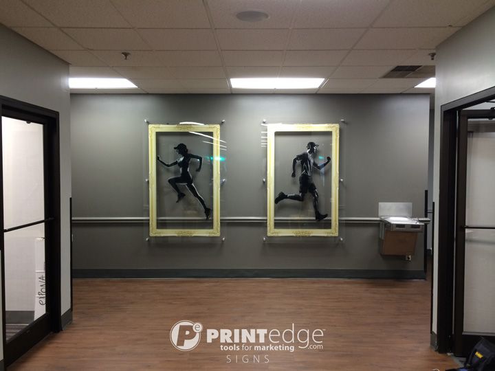
We love it when our customers are able to present themselves on the cutting edge of design trends. National Fitness Center is constantly adding visual appeal so their clients will know that they are more than just a number. For example, instead of using traditional arrow signs to point to the Mens & Womens Locker Rooms, they display these beautiful #acrylic #signs with monochromatic athletes heading in the appropriate direction. It's subtle details such as these that make lasting impressions and keep customers coming back for more!
Click here to see more images of this job!


